


Intro
2022 has been a year in which I've read a lot more books than usual, many thanks to the wonders of listening to audiobooks at 2x speed. I've wanted a way to catalogue these books so I thought I should build my own virtual bookshelf, because obviously there are no apps or websites that do this already, right? More so, I suspected that building a book shelf would be a good exercise in learning and practicing some CSS tricks that were not yet familiar to me. So without further ado, here's how it went! 📚🤓
Starting Point
My book shelf is modeled after the older design of iBooks as shown in this image:
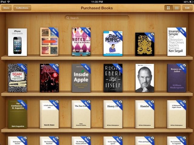
Source: Cult of Mac
Each layer of the shelf is essentially a rectangular cuboid, so I started with this implementation of a cube and extended it as described in the rest of this article. Here's a copy of the finalized code in that article, which was my starting point:
Sub goal 1: stretch the cube into a rectangular cuboid
To do this, I started by creating 3 css variables to represent the height, width, and depth of the cube, and I substituted them into the existing code. To understand which variable should go where, I thought about the transforms that were applied to each of the faces from their initial starting position (upright facing the screen). Using the bottom face as an example, it had transform: translateY(100px) rotateX(-90deg);, which meant it first got pushed vertically downwards by half the height of the cube then rotated to face downwards. To reflect this I needed to change its translateY(100px) to translateY(calc(var(--height) * 0.5)). More so, due to the rotation, the edge that was previously the height had become the depth. So I updated the height property by setting it to the --depth variable. Reasoning similarly for the other faces, I ended up with the following changes:
:root {
  --height: 200px;
  --width: 200px;
  --depth: 200px;
}

.container {
  width: var(--width);
  height: var(--height);
  ...
}

.cuboid {
  width: var(--width);
  height: var(--height);
  ...
}

.cuboid__face {
  width: var(--width);
  height: var(--height);
  ...
}

.cuboid__face--front {
  transform: translateZ(calc(var(--depth) * 0.5));
}

.cuboid__face--back {
  transform: translateZ(calc(var(--depth) * -0.5)) rotateY(180deg);
}

.cuboid__face--left {
  transform: translateX(calc(var(--width) * -0.5)) rotateY(-90deg);
  width: var(--depth);
}

.cuboid__face--right {
  transform: translateX(calc(var(--width) * 0.5)) rotateY(90deg);
  width: var(--depth);
}

.cuboid__face--top {
  transform: translateY(calc(var(--height) * -0.5)) rotateX(90deg);
  height: var(--depth);
}

.cuboid__face--bottom {
  transform: translateY(calc(var(--height) * 0.5)) rotateX(-90deg);
  height: var(--depth);
}
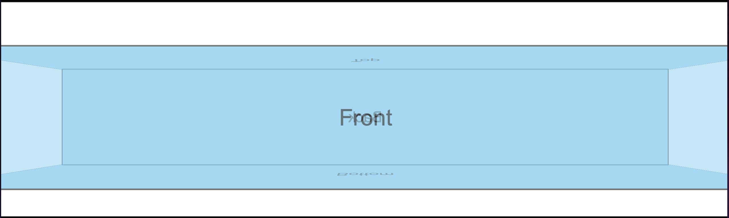
At this point the cube still looked the same, but theoretically I could stretch it into a cuboid by simply setting the --width variable to a value that's higher than that of the --height variable. To test this, I used a value of 90% for --width, which made the cube look like this:
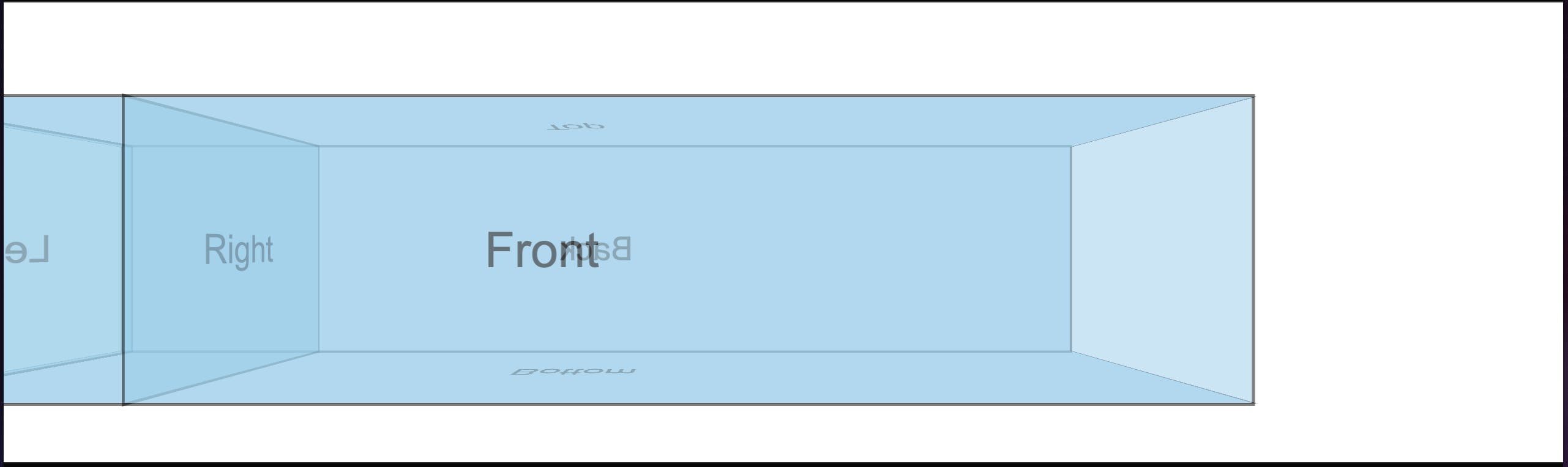
A rectangular cuboid! 🥳
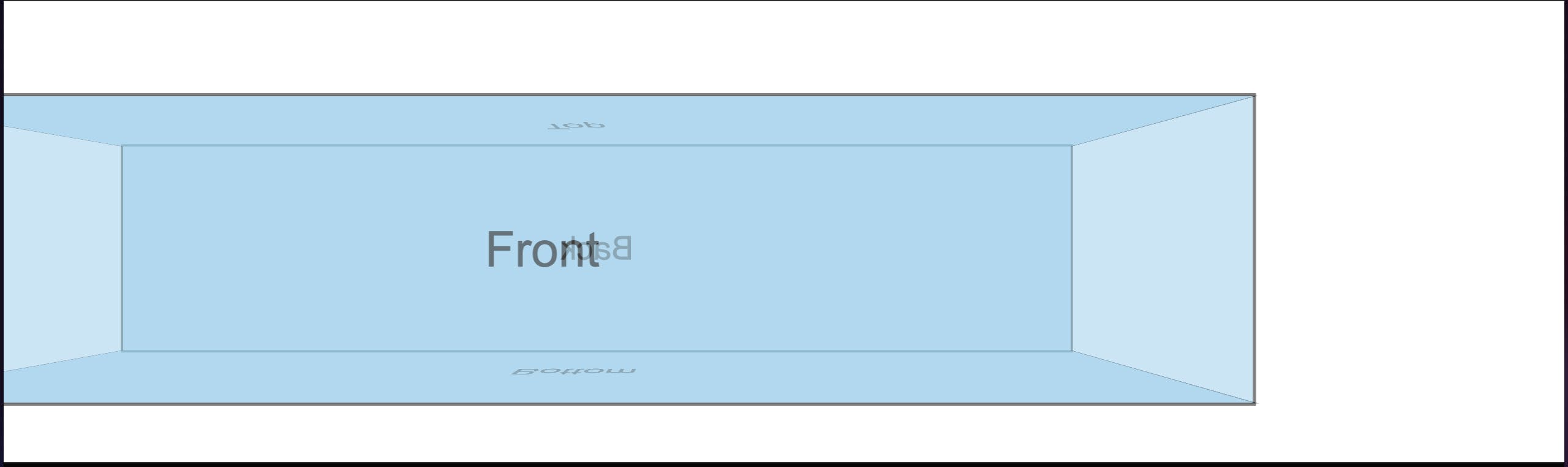
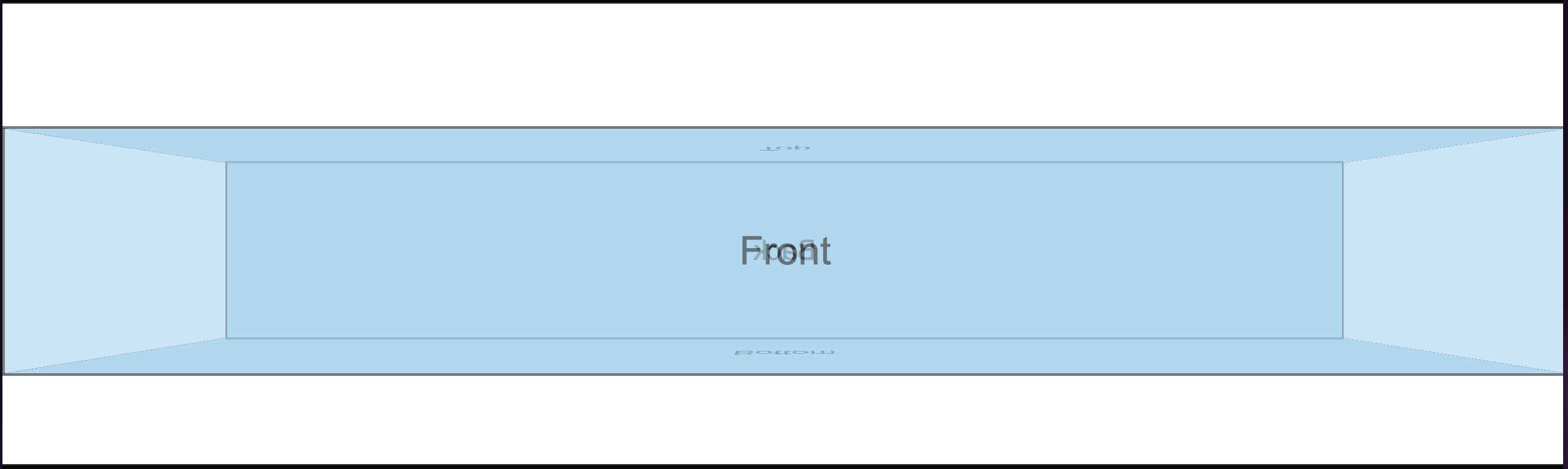
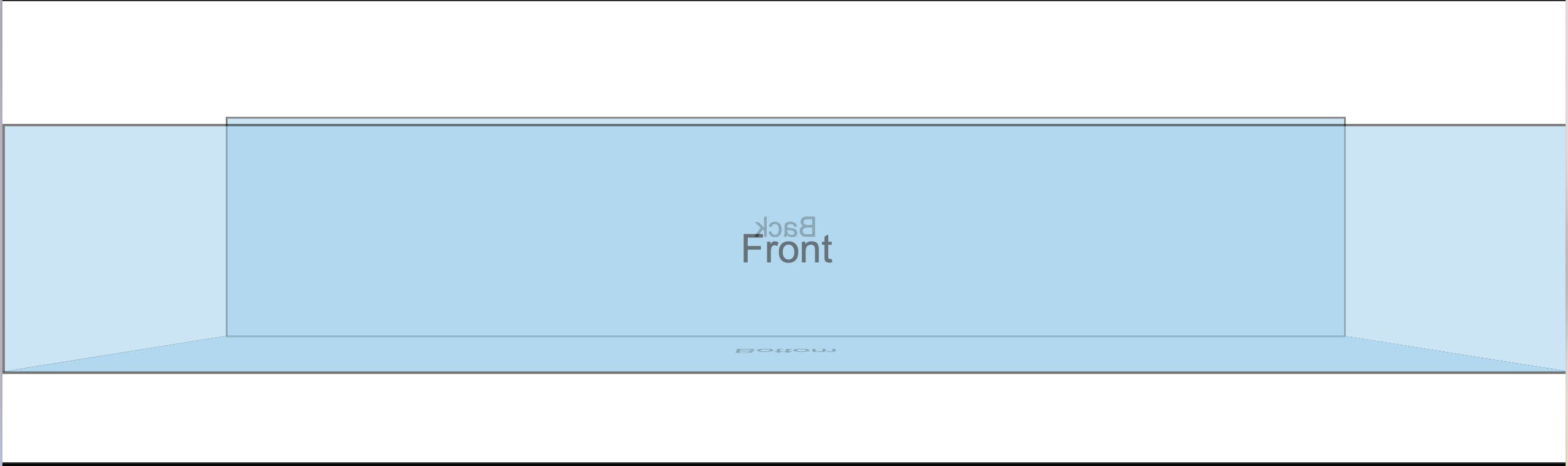
Notice, however, that the left and right faces didn't quite adjust as expected. I initially tried to solve this, but after some head scratching I recognized that I only really needed the demarcations of the faces. In other words, if I had the front, back, top and bottom faces, I would be able to implicitly demarcate the left and right faces. Therefore, I could actually remove the side faces entirely, leaving the cuboid looking like this:
Revisiting the iBooks screenshot above, the shelf fills up the width of the viewport, so I needed to set the --width variable to 100%. Doing that made the cuboid look like this:
Something was clearly still off at the left and right edges of the viewport - the front face seemed to be overflowing the container. My first thought was that I needed to do some trigonometry to figure out how many pixels should be subtracted from the cuboid's width in order to constrain the front face to the viewport's width. Thankfully there proved to be a far less complicated solution once I remembered that the initial cube was made by moving all the faces, particularly the front and back faces, away from their starting position. Put differently, the 100% value is the width of the initial state of each face, which meant that the front face overflowed its container because it was "pulled forward" by half the cuboid's depth (recall that at this point the front face had transform: translateZ(calc(var(--depth) * 0.5));). To further illustrate this, I added another cuboid face that had no transforms so that it would occupy the initial position of the faces. You can see it in red in this screenshot:
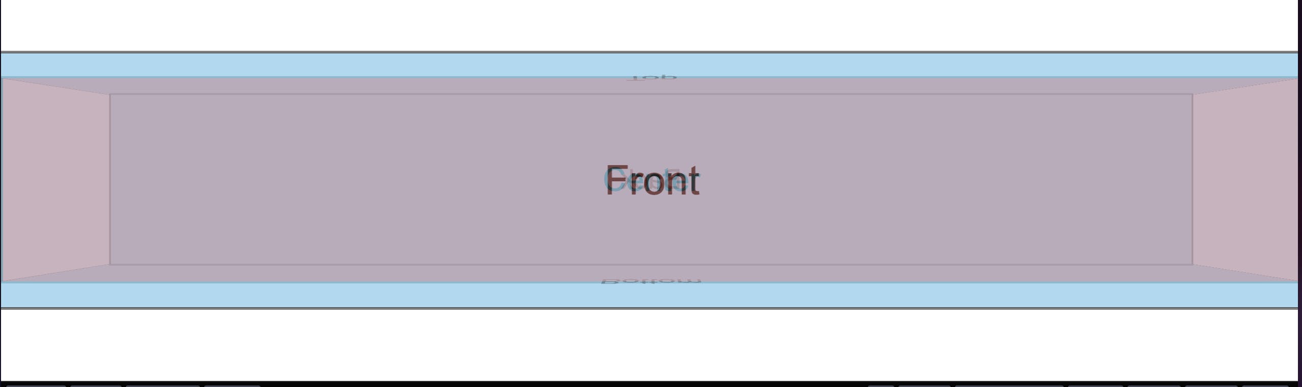
That untransformed red face filled exactly the width of the container as the 100% value would suggest. Thus the solution became clear: the front face needed to be kept at the initial position and all the other faces needed to be "pushed back" based on the depth of the cuboid. Returning to the example of the bottom face, its transform at this point was transform: translateY(calc(var(--height) * 0.5)) rotateX(-90deg);, which meant it first got pushed vertically downwards by half the height of the cube then rotated to face downwards. The first step should actually be to push the face backwards by half the depth of the cuboid so that its final position would span from the bottom edge of the front face to the bottom edge of the back face after the translateY and rotateX are applied. In Code This Means a translateZ(calc(var(--depth) * -0.5)) was needed at the beginning of the existing transform. Reasoning similarly for the other faces led to these changes:
.cuboid__face--front {
}

.cuboid__face--back {
  transform: translateZ(calc(var(--depth) * -1)) rotateY(180deg);
}

.cuboid__face--top {
  transform: translateZ(calc(var(--depth) * -0.5)) translateY(calc(var(--height) * -0.5)) rotateX(90deg);
  height: var(--depth);
}

.cuboid__face--bottom {
  transform: translateZ(calc(var(--depth) * -0.5)) translateY(calc(var(--height) * 0.5)) rotateX(-90deg);
  height: var(--depth);
}
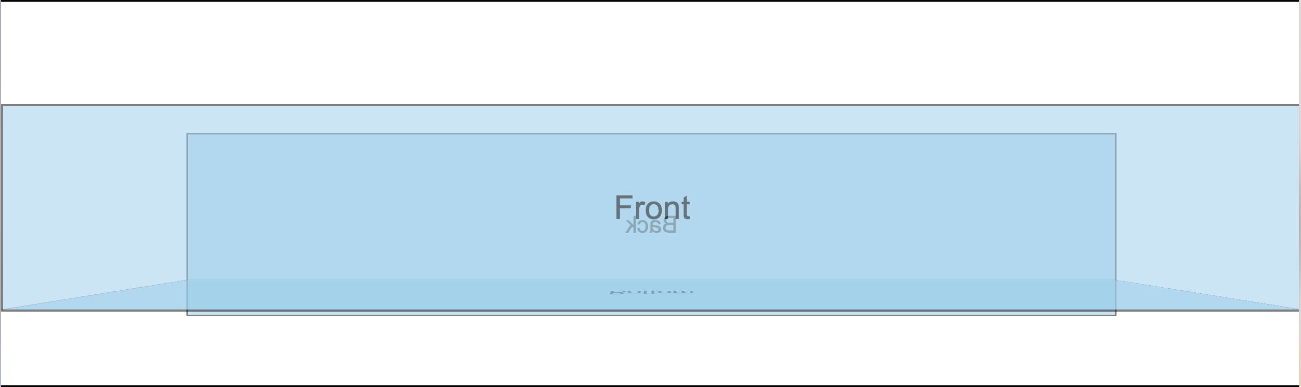
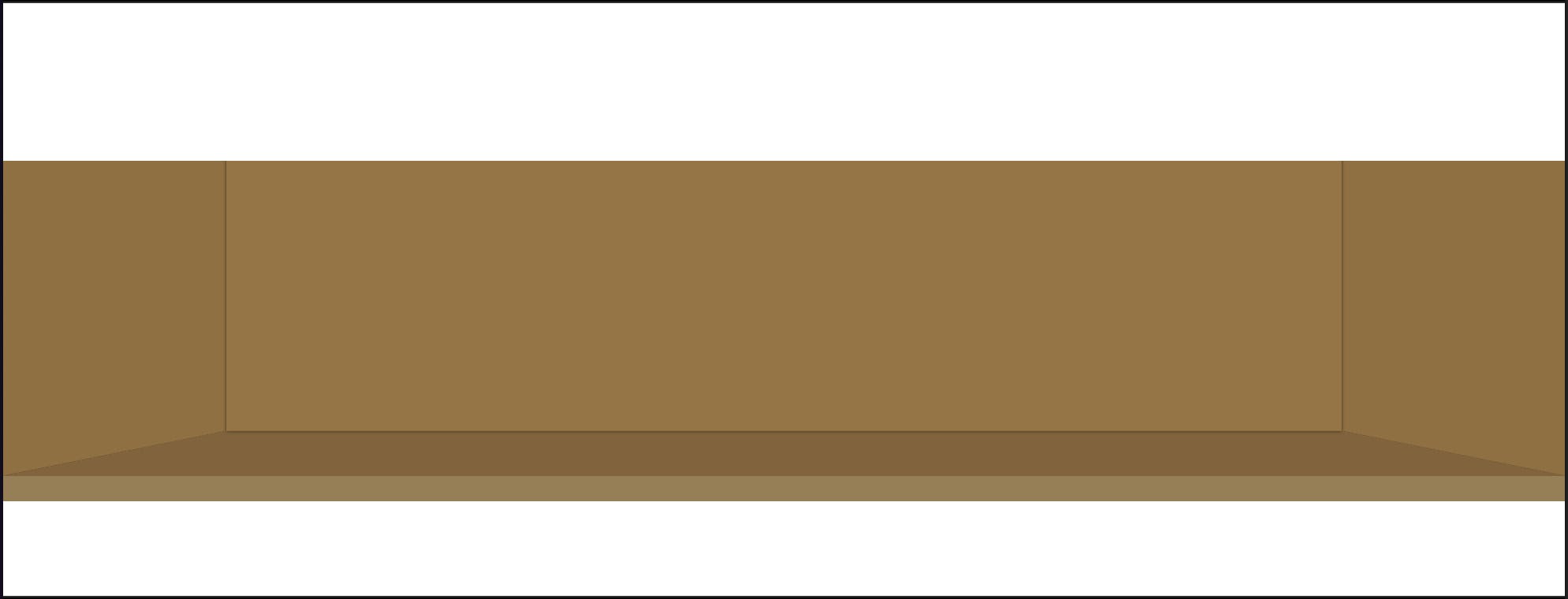
Notice that I removed the transform entirely from the .cuboid__face--front because the front face needed to be kept in its starting position as mentioned above. After these changes the cuboid looked like this:
Much better! 👌🏾
Sub goal 2: complete the shelf appearance
First, in the iBooks screenshot there's actually no top face. The flat horizontal base of the upper shelf covers what would be the top face. I chose to remove the top face entirely and extend the height of the back face such that it would hit the topmost part of the shelf container. The additional height didn't need to be precise, it just needed to be enough to cover the distance between the top edge of the back face and the top of the shelf container. 3rem proved to be sufficient:
.cuboid__face--bottom {
  --extra-height: 3rem;
  transform: translateZ(calc(var(--depth) * -0.5)) translateY(calc(var(--height) * 0.5)) rotateX(-90deg);
  height: calc(var(--depth) + var(--extra-height));
}
As a result of that change the cuboid looked like this:
The added height actually caused the face to grow downward instead of upward! 🤔 Why was that? It's all about the transforms baby! At this point the back face had a rotateY(180deg) in its transform, which meant that its top edge was facing downward and vice versa for its bottom edge. So the extra height got added at the top, but with the top edge facing downward. I rectified this easily by prepending a corresponding negative translateY to push the face down initially, knowing that the downward push would eventually turn upward because of the rotateY(180deg). In Code This Means:
.cuboid__face--back {
  --extra-height: 3rem;
  transform: translateY(calc(var(--extra-height) * -1)) translateZ(calc(var(--depth) * -1)) rotateY(180deg);
  height: calc(var(--height) + var(--extra-height));
}
Now the cuboid looks like this:
I then applied overflow: hidden on the shelf container to trim off the overflow at the top, after which I also needed to remove the border: 2px solid black; from the faces to make sure the alignment of the edges remained intact. The outcome was this:

Getting closer! Time to flesh out some of the finer details. First I added the thickness of the shelf floor with a simple div below the .container div, and gave it a slight height. Next I updated the background colors to use shades of brown that look closer to wood. I then added box shadows to give a bit more depth to the look of the shelf. Lastly I gave the front face a transparent background so that it wouldn't obscure the faces behind it, and I removed the text in the .cuboid__face divs. These changes left the cuboid looking like this:
Almost there!
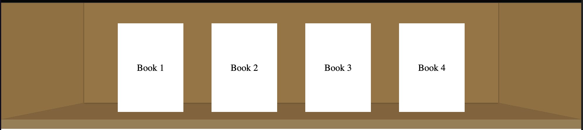
Sub goal 3: adding books to the shelf
I needed to achieve two main objectives: ensure that the books overlay the back and bottom faces of the cube, and position them such that they would appear to be sitting on the floor of the shelf. The first objective was achieved by creating a .books-container div whose height was equal to the height of the cuboid, and giving it position: relative to ensure that it overlaid the cuboid container (because the .container was in its own layer due to having position: absolute). The second objective was achieved by adding a row of divs, each representing a book, within the .books-container, and adding a little padding-bottom to the .books-container to simulate the books standing in the middle of the shelf floor as in the iBooks screenshot. After these changes the shelf looked like this:
🙌🏾 🙌🏾
One last detail: the shadow at the top of the shelf that simulates the effect of light being blocked off by the "ceiling" of the shelf. I added that using a box shadow, leaving the shelf looking like this:
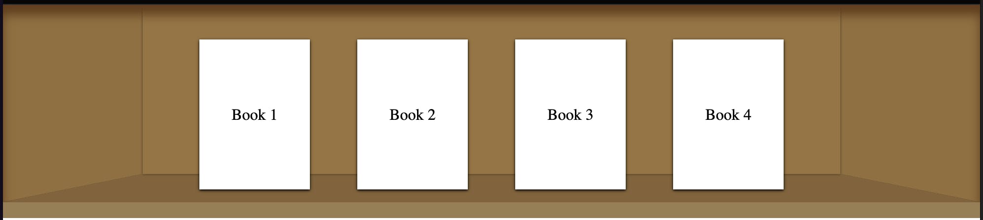
😍 ✅
Putting it all together, the code thus far is viewable in this codepen.
Conclusion
This was a fun little side project through which I learned about the perspective property and learned how to use and think of different CSS transforms (I sliced the air with my hands quite a lot because order of transforms is really important). One possible improvement would be to angle the top shadow on the left and right faces to give a more realistic depiction of how the shadows fall, as seen in the iBooks screenshot. I tried to achieve that with pseudoelements but didn't succeed in making it look realistic enough. The final live bookshelf showing my books is available at halfbaked.ucheoz.tech so feel free to have a look and let me know what you think. You can always reach me at @cinexa7254 on twitter and you can connect with me on LinkedIn.